
Infographiq
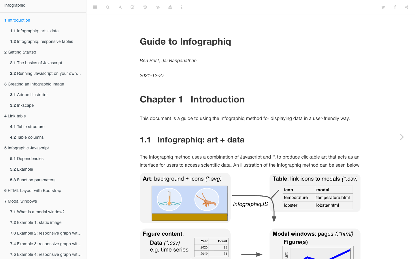
Infographiq combines JavaScript and R to produce clickable illustrated diagrams — “infographics” in the ecological sense — that serve as intuitive interfaces for exploring scientific data. Each element in the illustration is linked to a data popup, allowing end users (managers, educators, the public) to explore ecosystem indicators by clicking on species or habitat features they already recognize visually.
The method has been deployed across multiple U.S. National Marine Sanctuary condition reports and NOAA IEA ecosystem assessments:
| Organization | Builder library | Instances |
|---|---|---|
| MBON | infographiqJS · infographiqR | method docs |
| NOAA-ONMS | onmsR | Channel Islands NMS · Olympic Coast NMS |
| NOAA-IEA | plotJS-extra | Florida Keys NMS · Alaska IEA |
How it works
A scientific illustrator produces an SVG of the ecosystem. Each element (e.g., a kelp stipe, a sea otter, a fishing boat) is given an ID in the SVG. The Infographiq JavaScript library intercepts clicks on those IDs and opens a configurable panel displaying the corresponding time-series plot, data table, or narrative. The R library handles the data pipeline: pulling indicator data from ERDDAP or other sources and rendering plots that embed cleanly in the popup.
The result is a product that is genuinely accessible to non-specialists while being backed by the same data that scientists and managers use.